

It is a concern I hear very frequently from small business owners that they run ads and get many clicks but they do not lead to purchases. While many tend to look for the cause only in ad creatives or targeting, in reality, more than half of the battle is already decided on the page reached after the click—that is, the landing page.
A landing page is not simply a "pretty detail page." It is a page designed to allow visitors to determine within three seconds, "Is this what I need?" and, if that judgment is correct, lead to the next action (purchase, inquiry, reservation). Without this design, the conversion rate will remain stagnant no matter how much you increase your advertising budget.
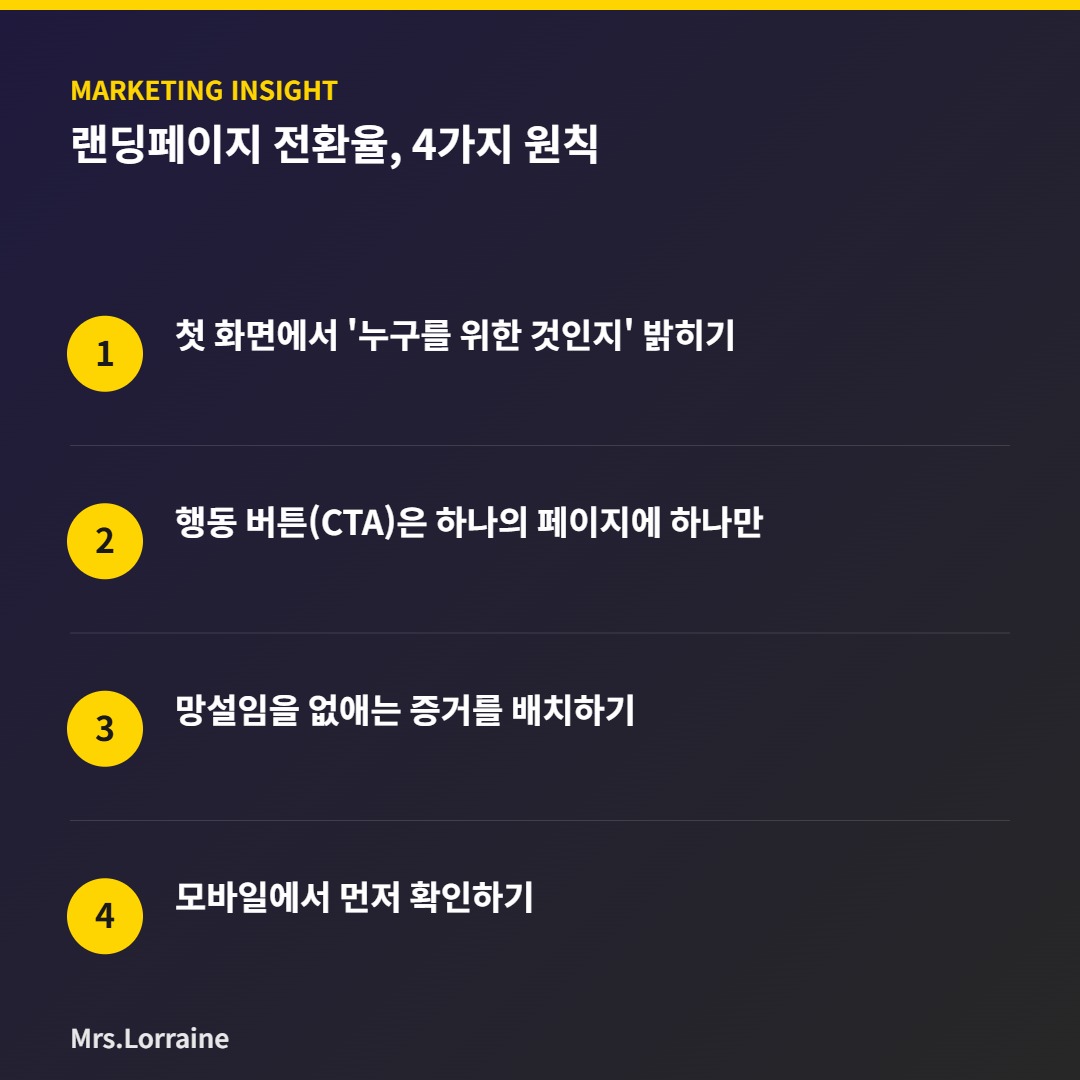
4 Principles to Increase Conversion Rates
Principle 1. Clearly state 'who it is for' on the first screen
Visitors decide whether to stay or leave based solely on the first screen before scrolling. “Who is this product for?” must be clearly revealed in the title or subtitle. If a specific target audience is visible, such as “For office workers in their 30s” or “For sensitive skin,” people belonging to that group will stop and read further.
Conversely, phrases designed to satisfy everyone fail to catch anyone's eye. In fact, one student shared that simply changing the phrase “OOO that everyone likes” to “OOO for those who are short on 10 minutes before work” significantly increased their time spent at the site.
Principle 2. Only one Call to Action (CTA) per page.
If multiple buttons such as “Buy Now,” “Inquire,” “KakaoTalk Consultation,” and “Get Coupon” are mixed together on a page, visitors are less likely to click anything. This is because the more options there are, the more the decision is delayed. The first step is to determine the single action you want this page to encourage and remove the rest of the buttons.
Button text also has a higher click-through rate if it specifically shows the result of the action, such as "Get a 10% discount now," rather than "Submit" or "Confirm.".
Principle 3. Arranging Evidence to Eliminate Hesitation
Elements that serve as 'evidence,' such as price, reviews, before-and-after comparisons, and the production process, should be placed immediately below the point where visitors hesitate. For instance, if you place reviews or data explaining "why this price is justified" in the paragraph immediately following the price, resistance to the cost will be reduced.
It is not that more evidence is better; it is effective only when placed precisely at the moment a visitor pauses and wonders, "Is this okay?".
Principle 4. Check on mobile first
Most customers visiting small business owners arrive via mobile. However, many landing pages are designed for PC screens and are left unresolved on mobile devices, resulting in broken text or unresponsive buttons. Before launching a page, it is essential to test it from start to finish on your own mobile phone.
None of the four principles require elaborate techniques. You can start by simply reviewing your existing pages and reading them again from a visitor's perspective. Beginning with these small checks, Mrs. Lauren is working with small business owners to find ways to increase conversion rates without spending more on advertising.